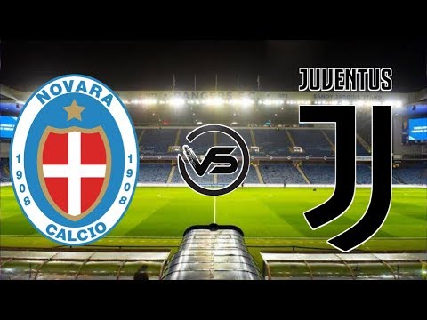
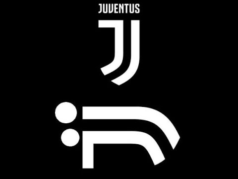
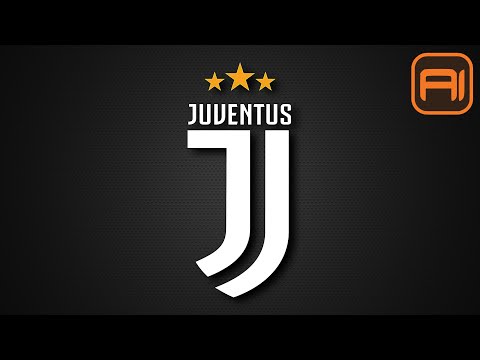
Juventus’ new logo has been the talk of the football community. Why have they re-branded in this manner and is it a positive move for the club? Nicholas Carroll give his view.
PATREON: https://www.patreon.com/forzaitalianfootball
WEB: http://forzaitalianfootball.com/
TWITTER: https://twitter.com/serieaffc
FACEBOOK: https://www.facebook.com/forzaitalianfootball
INSTAGRAM: https://www.instagram.com/forzaitalianfootball/
Presented by Nicholas Carroll – @niczcarroll
Music: ‘Moose” – Bensound.com







looks awful. I hate it.
The only reason why you can't comprehend the logo, is because you can't subject to change. In Juventus' past history in the 60's the jumper was used to have a J as the badge. As the brand is using the letter 'J' for everything: J museum, J Academy, J Medical hell even the mascot is called Jay. The badge is professional and slick, which they can brand them self outside of football like Real Madrid has done. It is in the shape of a scudetti and brings out the tradition of the black and white colors. Heritage is always kept with the club history with the colors.
I agree it's missing it's bull but they can add that in at anytime. They have derived the logo from past ones. So instead of criticizing a club for something how about doing some research before making yourself sound like an idiot.
???
Agnelli knows what he's doing. Firstly I didn't like that logo but after time I think that's not that bad idea. That logo on new, black kits looks outstanding. In our hearts Juventus still have its history and tradition but if Juventus only thought about those we couldn't afford Higuain for 90mln euros.
FOOTBALL CLUBS SHOULD RESPECT FANS, HISTORY AND CLUB CULTURE. THIS DESIGN IS AWFUL AND DESERVES ALL THE STICK IT GETS. i REMEMBER 3 YEARS AGO MY CLUB EVERTON DECIDED TO CHANGE THE WAY THE CLUB CREST LOOKED AND QUITE RIGHTLY THE FAN BACKLASH SOON MADE THE CLUB REALISE ITS MISTAKE AND IT WAS DITCHED AFTER ONE SEASON. WE NOW HAVE ONE THAT REPRESENTS THE CLUB AND ITS TRADITION AND HISTORY AGAIN. CAN ONLY HOPE THE SAME COMMON SENSE IS REALISED HERE.
(((( Ju )))